Design
System
One source of truth for design agencies.
Client
Johnson & Johnson Innovative Medicine
Role
UX Designer
Team
6 UX designers, 2 senior UX designers, developers, producer
Duration
3 months (October - December 2023)
Tools
Figma, Storybook, zeroheight
Project
Overview
Johnson & Johnson Innovative Medicine had different teams and agency partners creating digital experiences across brands and platforms. Over time, a lot of the same patterns were being rebuilt in slightly different ways.
This project was about creating one shared design system across Figma, zeroheight, and Storybook, so designers, developers, and agency teams could work from the same place instead of constantly recreating things.
Challenge
The main challenge was that the work felt scattered. It was not just about making a neat component library. The system had to be useful and clear enough for agency partners to follow and flexible enough to work across different needs. At the same time, it needed to make J&J’s digital experiences feel more consistent.
Impact
The final design system included 50 reusable components, documentation across zeroheight and Storybook, WCAG 2.2 accessibility support, and an 80-page usage guide for agency onboarding. It contributed to a 20% reduction in review cycles and a 45% reduction in project timelines.
Role
I audited existing patterns, creating components in Figma with variants, states, styles, added accessibility notes and helping create the 80-page guide for agency teams.
01.
Working with a lot of different agencies meant a lack of coordination.
The issue was not a lack of design. It was too many versions of the same design decisions.

Defining all the problems that arise
02.
The system had to be useful across design, development and approval.
The design system needed to work for more than one type of person.
Designers needed reusable components.
Developers needed clear specs.
Agency teams needed guidance they could follow without asking the same questions again.

User personas: same set of instructions had to be usable for a variety of people.
03.
Turning repeated patterns into reusable rules.
Atomic design helped organize components from smaller elements into larger page patterns.

Grid System Architecture
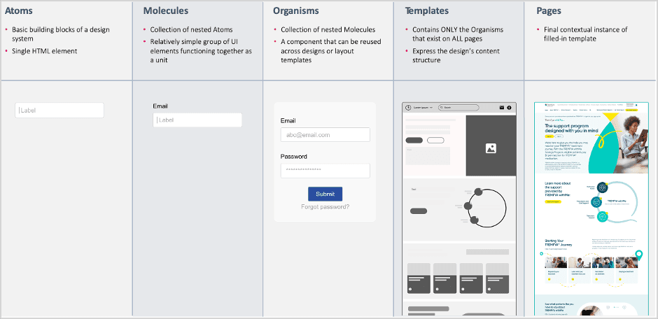
Atomic design methodology
04.
Making components flexible enough to reuse.
The components had to account for different content needs, interaction states, accessibility requirements, and future updates.

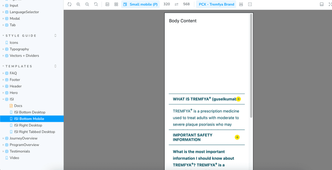
Design styles and component with states prototyped could be downloaded to quickly build templates
05.
Documentation became part of the design.
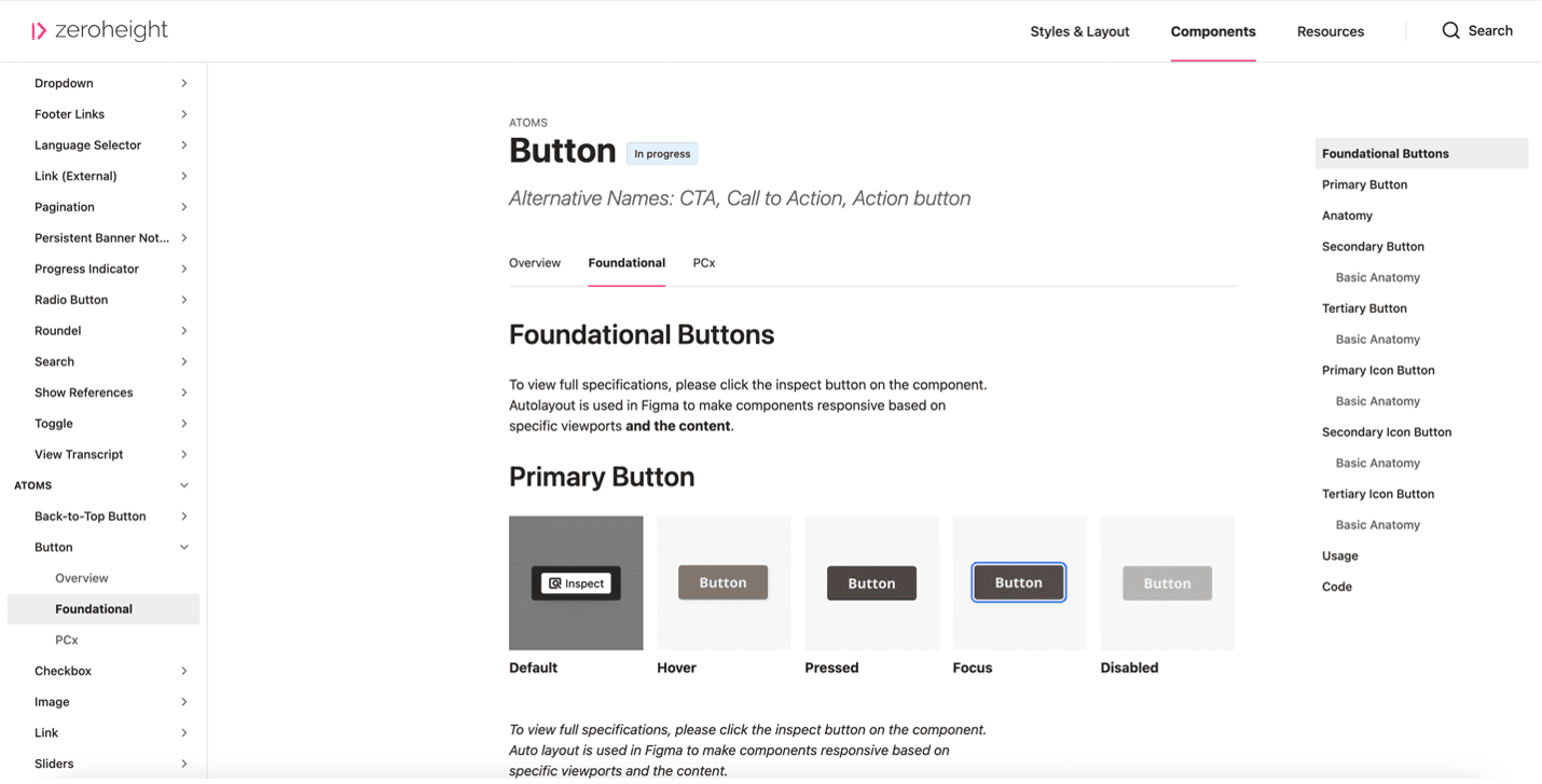
Each component was documented in zeroheight with usage guidance, best practices, accessibility notes, and Storybook references. This helped connect the design files to development implementation.
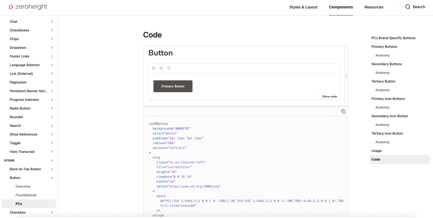
Clicking on "Show code" takes the user to Storybook.
Code for component in Storybook.
06.
From library to adoption.
The final part of the work was making the system easier to adopt. We reviewed it with stakeholders, tested it with agency users and refined the documentation based on feedback.
Along with zeroheight, we also created an 80-page usage guide covering debugging, resources and implementation guidance, so partner teams had a clearer way to start using the system in real projects.
Clicking on "Show code" takes the user to Storybook.